Decorating and furnishing a small space can be a challenge. Because form and function sometimes compete in a small space, careful consideration needs to be paid to WHAT goes in the room and WHERE.
The eye travels quickly around a small room,
Trading Spaces designer Laurie Smith – Source iVillage.com
so you want everything to have meaning
and impact or at least be tailored and make sense
in the space.
With this in mind, we’ve collected a few of the BEST decor tips to help make a small space appear bigger. These are some of the quickest and easiest to accomplish within a small space.
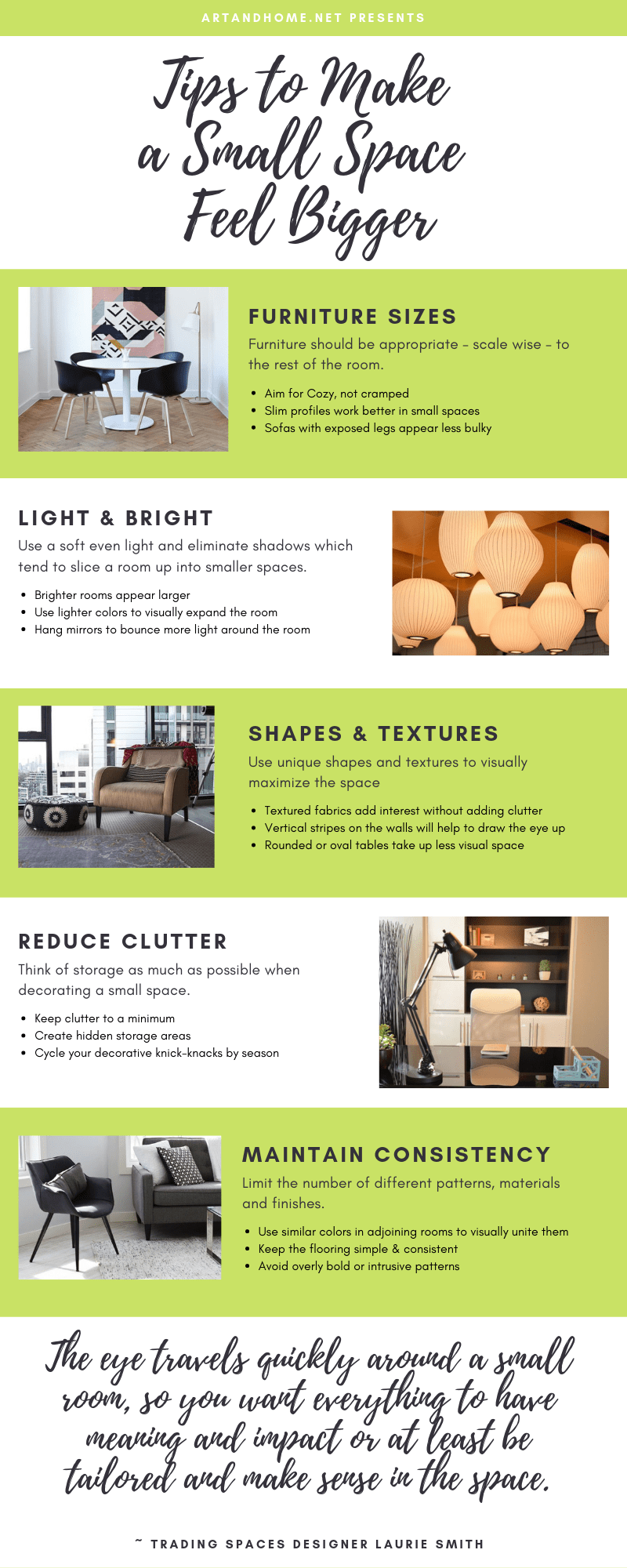
Although that handy home decor infographic covers a lot of the tips we have gathered, keep going to read all 25 of the BEST home decor tips we’ve collected to help make a small space appear bigger.
1 – SIZE MATTERS
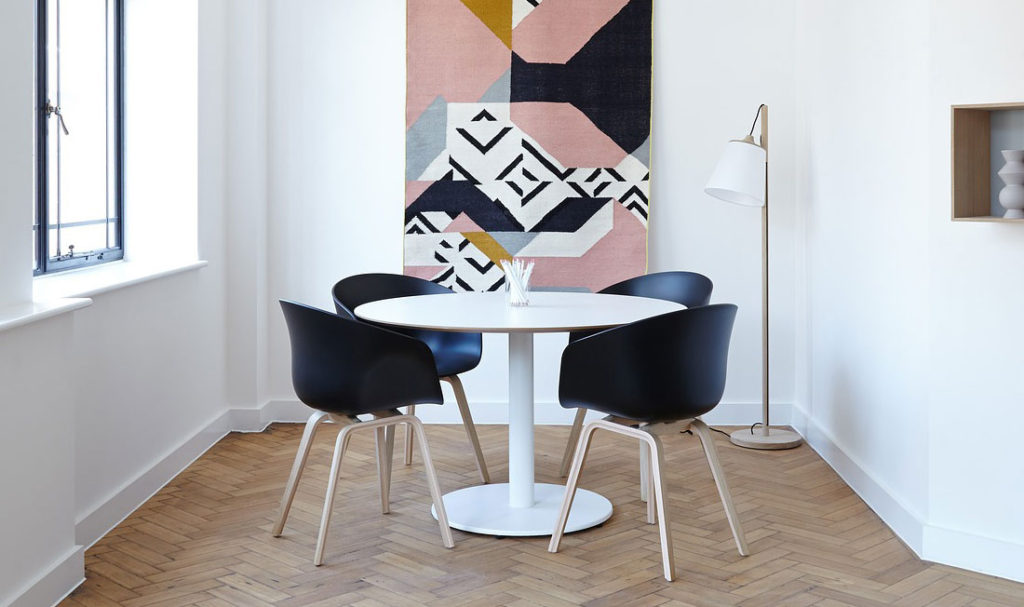
If the room is small, be careful not to buy the largest pieces of overstuffed furniture you can find. Furniture should be appropriate – scale-wise – to the rest of the room. That doesn’t, of course, mean that everything needs to be miniature… you’re not a doll, and you don’t need to turn your home into a dollhouse.
You can make a compact room feel much bigger by choosing fewer larger, bolder (it’s important to note bolder does not mean bigger) pieces instead of several smaller ones.
Scale and coordination are the keys.
You’re going for Cozy, not Cramped. But don’t go too far to the other extreme, a small room… very sparsely decorated… will maintain the visual appeal of a small room.
Slim, streamlined, and minimalist furniture pieces, such as arm-less Parson chairs, are beautiful space savers.
Also, a sofa with exposed legs will appear smaller and less bulky than one with hidden legs. Small end tables and decor accents will make a room seem larger by comparison, creating an optical illusion of more space.
2 – LET THERE BE LIGHT
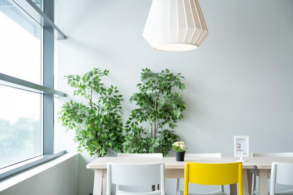
Use a soft even light and eliminate shadows that tend to slice a room up into smaller spaces. If you have low or average-height ceilings, avoid overhead lighting – as this will visually lower your ceiling. However, if you have high ceilings, a unique pendant light, sparkling chandelier, or ceiling fan can help draw the eye up to the vertical volume of a room.
If you have a lack of windows to provide natural night, you can also try to focus the lighting around the perimeter of the room, as this will effectively push the walls back, providing an illusion of more space.
3 – LET THERE BE HEIGHT
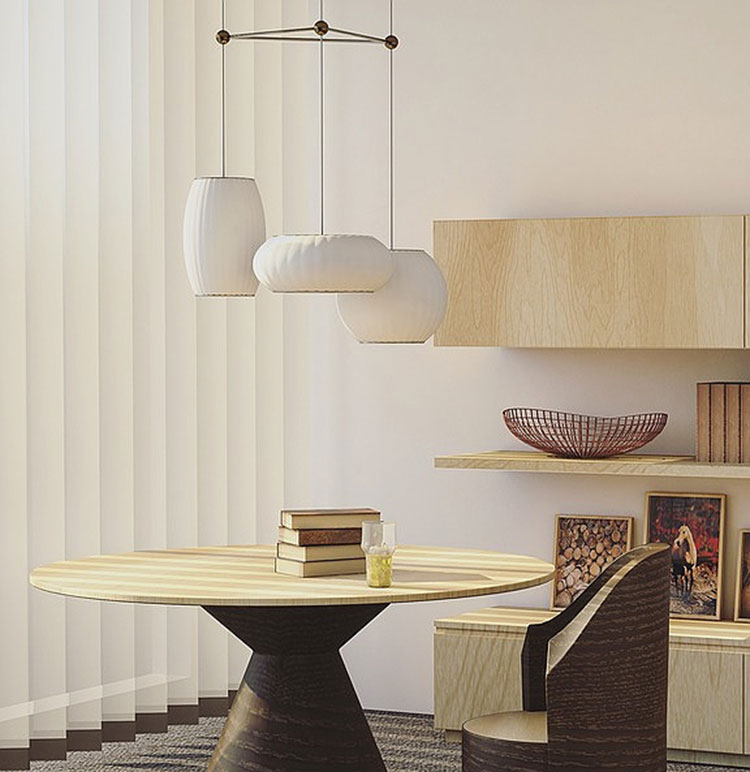
Use at least one tall element in a room to draw the eye upward, towards the ceiling. This takes the eye in a different direction so that it’s paying attention to the height of the room and not the lack of width or depth.
A really nice way to combine the last two tips is to make that tall element a unique and attractive light fixture. This can be a standing lamp, a tall table lamp, or a hanging ceiling light. Either way, it provides visual interest to draw the eye toward the ceiling AND provides additional light in the space.
Or, you can hang seldom used but attractive things on the wall to combine visual appeal and storage. A win-win situation.
Of course, these high tricks might not apply if you have very low ceilings. In that case… just ignore this bit and move on…
4 – KEEP IT SIMPLE
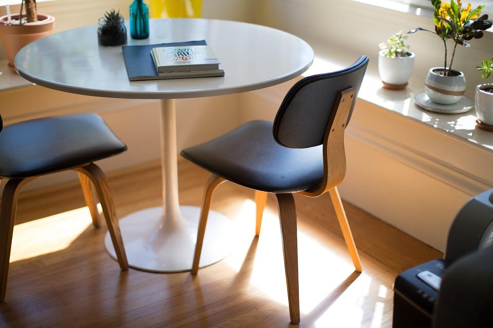
Don’t let loud or bold patterns take over the room. Bold patterns and prints can still be used as focal points or accents within the room, but keep them to a minimum.
A simple and clean color palette with a few decor accents to provide a pop of color and texture will do quite nicely in a small space.
5 – COLOR YOUR WORLD
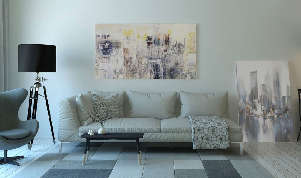
Use just one or two colors per room for visual simplicity that expands the space. Also keep in mind that white, neutral or pale colors best reflect light, visually “pushing back” walls. This is not a hard and fast rule, as many designers prefer richer colors in smaller spaces.
What you have to watch for when using rich colors in a small space is to reduce the contrast in the horizontal and vertical planes. For example, a light carpet, dark wall and white ceiling will often cause the walls to feel like they are “closing in” on you.
If you do decide to use a dark color, reduce the contrasts with the floor and ceiling. For example, continue the wall color onto the ceiling (or use a shade that’s only two or three shades lighter than the walls on the ceiling) to keep the contrast levels.
Instead, focus the contrast on the furniture or accents, keeping woodwork, cabinetry, and/or trim a contrasting neutral color such as cream. The dark color on the walls becomes a negative space for the detail and furniture up against it.
6. DO THE UNEXPECTED
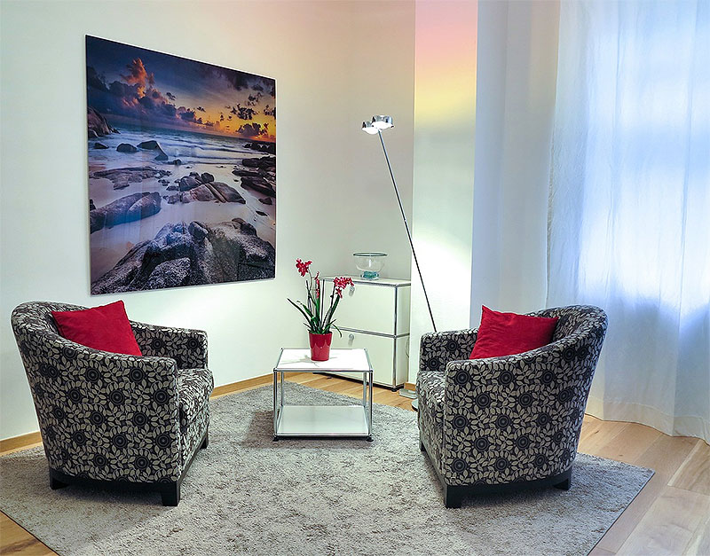
Don’t automatically center your artwork because that’s what you think you’re expected to do.
Pictures that are hung off-center force the eye to focus on something other than the size of the space. Two prints hung one above the other draws your eye up to the vertical space of the room.
7 – HANG ‘EM HIGH, HANG ‘EM WIDE
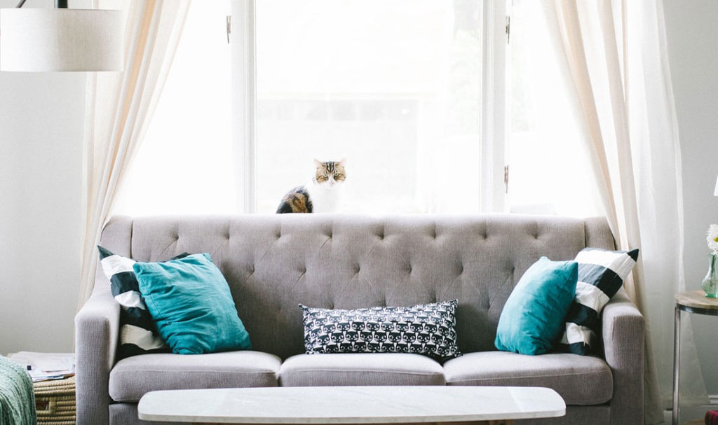
Extend drapery rods well beyond the height and width of the window, so curtain panels frame the view but can be opened fully to expose the entire window. This way, when the curtains are open, the maximum amount of natural light is allowed through.
When selecting your window-coverings, use sheers, tailored panels, or semitransparent Roman shades.
Besides letting in light, simple treatments do less to interrupt the eye, as it travels around the room. If you’re set on using shutters, make sure they’re white.
8 – THE MORE THINGS CHANGE…
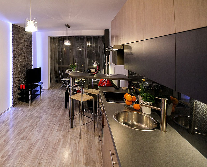
Maintaining consistency underfoot is especially important. In a small space, the one thing that should create an uninterrupted flow is the flooring. Wood flooring, carpet, or a single area rug in coordinating colors is best. Multiple flooring changes or multiple area rugs will “chop up” a room, making a small space feel like several even smaller spaces.
The exception to this rule will be if you are trying to create two “functional” areas within a single space (e.g. a writing desk in one corner, reading area in another). This treatment may demand the usage of two distinct area rugs to help “frame” the space.
9 – HIDE THINGS UNTIL THEY ARE NEEDED
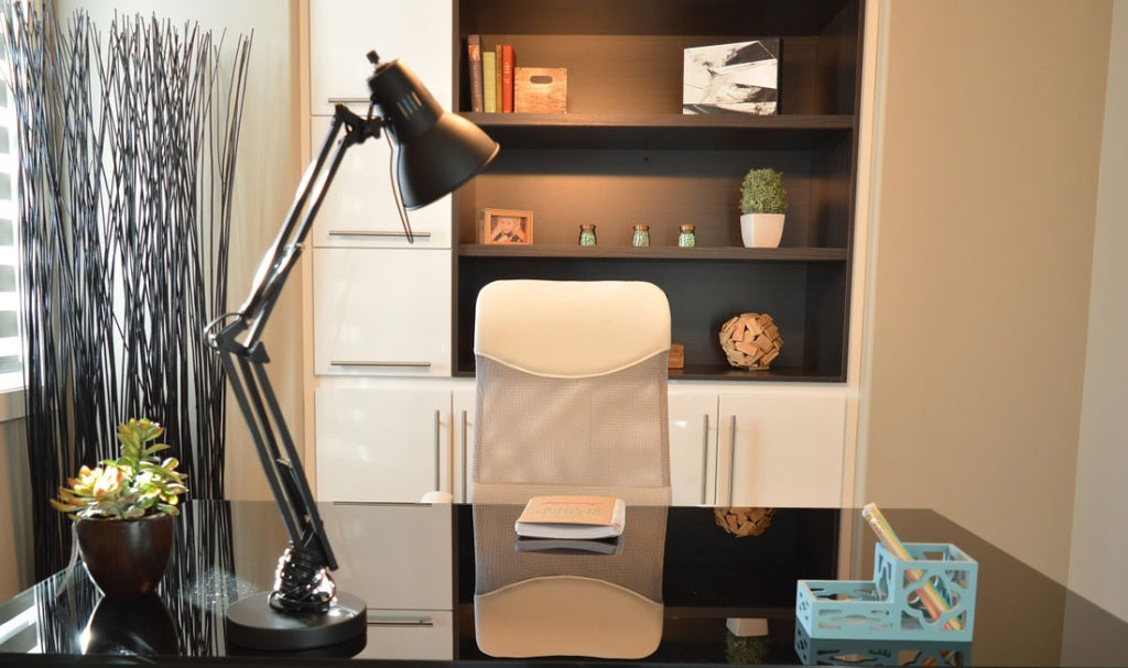
Think of storage as much as possible when decorating a small space. A sleek bookcase with light-colored doors can go a LONG way to hiding clutter and extended the look of a room.
Other great ideas include using skirts on beds or tables to create hidden storage areas. Also, ottomans that will slide under a coffee table or end tables can add much-needed seating without taking up floor space all the time.
Hide small clutter such as mail, pens, etc. inside vases, pitchers, or decorative boxes and baskets.
10 – DON’T BLOCK THE VIEW
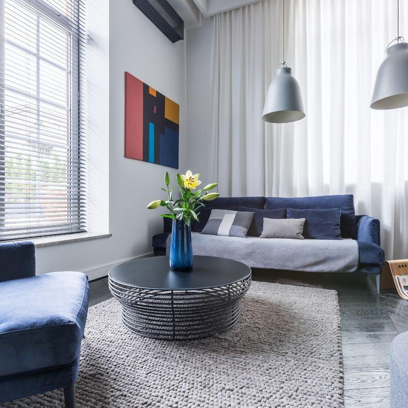
Try not to place anything in front of windows or french doors (except – of course – for light curtains for privacy).
If space is such an issue that you must overlap these spaces, use open, slim furniture that won’t obstruct the view or natural light.
11 – DOES THE SPACE WORK FOR YOU?
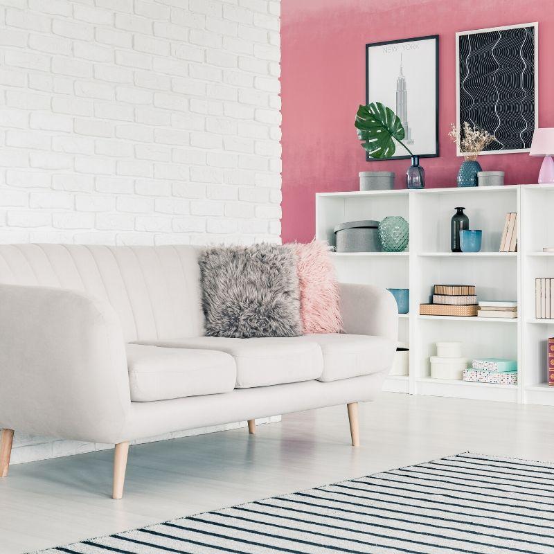
Look for ways to add functionality to the space. An attractive phone table/writing desk in the corner can create a sense of functionality that provides a feeling of additional space.
12 – MAXIMIZE STORAGE
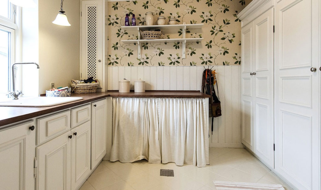
Build or install simple shelves that will create easy storage space.
Also, look for at least one piece of furniture that can provide some level of storage as well. A stunning armoire or buffet cabinet can provide visual appeal within a small room, and hide all of the unsightly clutter that makes a room seem small.
For kids rooms, look to maximize functionality & storage.
13 – I CAN SEE THROUGH YOU
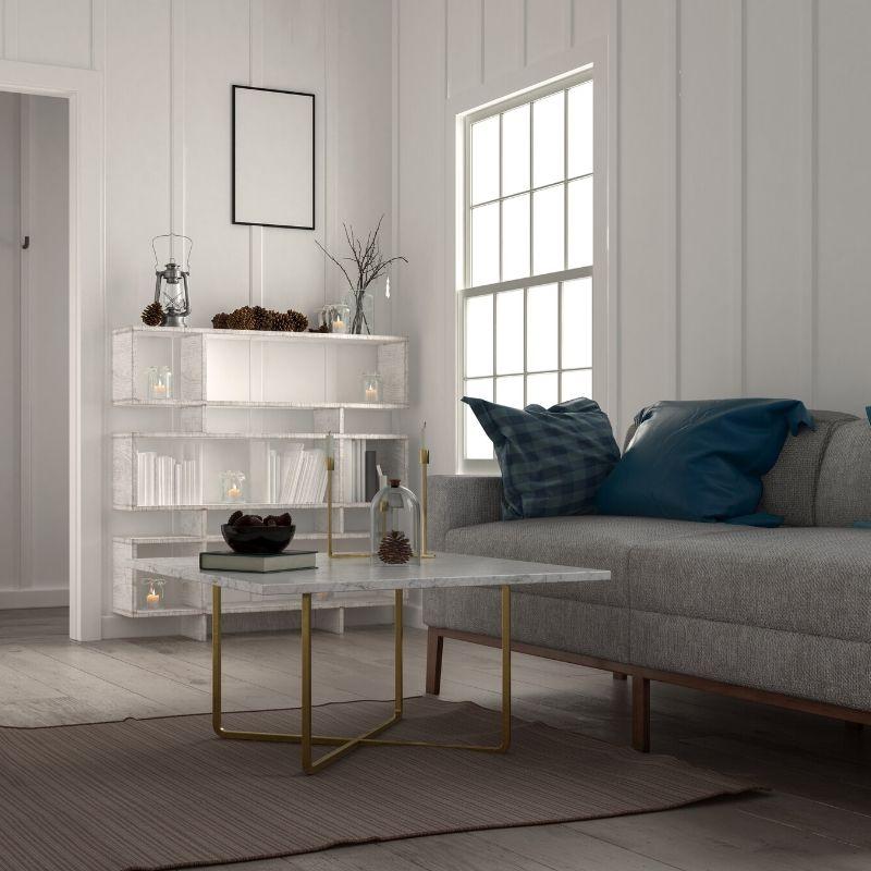
Remove solid doors completely or replace them with glass-paned French doors between rooms (providing privacy isn’t an issue). This opens up sightlines room-to-room and lets in more light, making each space feel more expansive.
Open bookshelves create an airier feel than their closed-door cousins.
Of course, these tips only apply if the items in the room can be displayed in a tidy way. Otherwise, use solid doors to hide the clutter.
Use the same technique with furniture. By selecting acrylic or glass coffee or end tables that allow you to see through them, you can trick the eye to believe there is more space in a room.
14 – A SMALL SPLASH IS PERFECT IN A SMALL SPACE
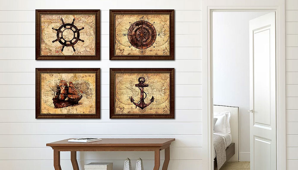
Introduce subdued patterns in little touches throughout a small room.
Accent pillows and floral arrangements are easy ways to add dashes of pattern or color without overwhelming the space.
However, keep these splashes to a minimum. As with an earlier point, it is often better to have one or two larger arrangements than have several smaller ones that end up creating a sense of clutter.
A huge vase of flowers or a group of houseplants can be replaced by a simple bowl of apples or a single-bloom orchid, which will provide the same visual impact while taking up far less space.
15 – USE YOUR WALLS
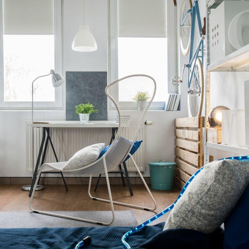
We often make the mistake of focusing solely on floor space available in a room and forget about all of the space provided by the walls. By maximizing the full height of your walls, you will get lots of extra storage, adding to the sense of space.
Install bookshelves, armoires, and cabinets that run floor-to-ceiling. This helps accentuate the height, as well as providing excellent storage space. And don’t forget to take advantage of the space above counters and shelves by adding decorative pictures, vases, or flowers.
16 – STRIPES ARE GREAT
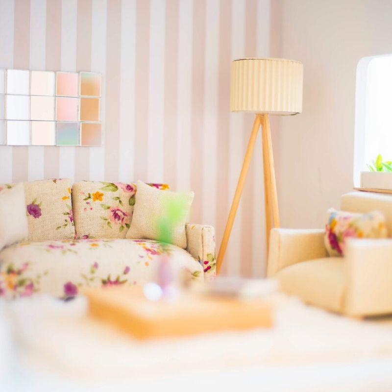
A vertical stripe motif to your walls, which can be painted on in neutral tones, such as creams and beiges, will help to draw the eye up to the ceiling… maximizing the sense of vertical space.
Again, this treatment is excellent for small spaces with tall ceilings, as it brings the focus to the overall size of the room, not just the floor space.
17 – COLLECTIBLES AND KNICK-KNACKS
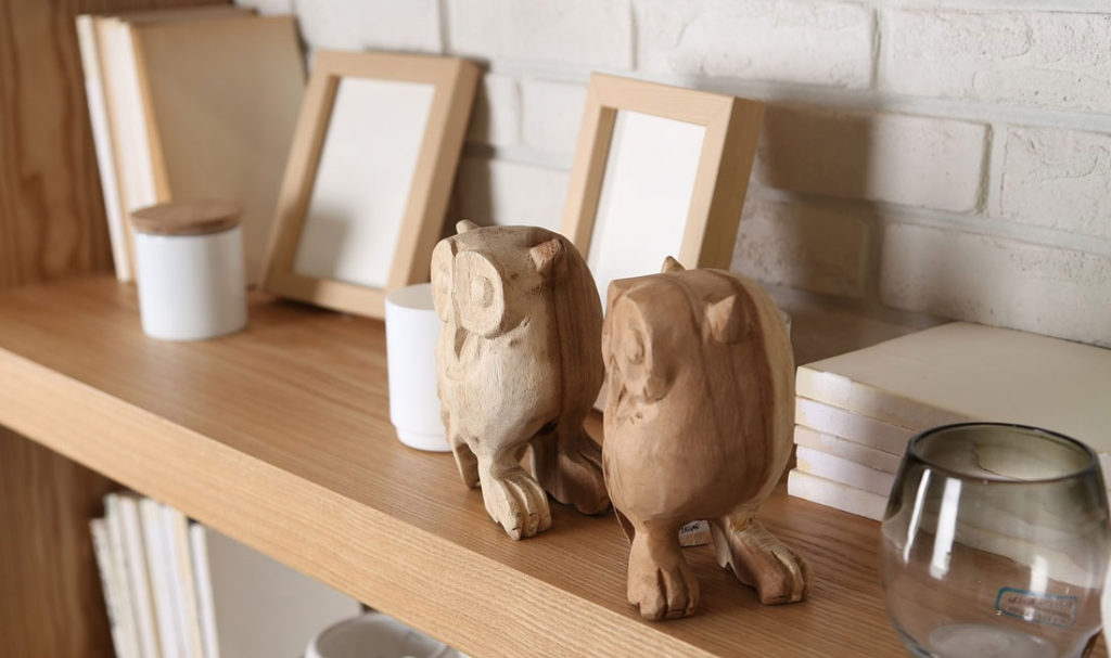
Display your collectibles with space around them, or choose one favorite piece (or pieces) and allow it to become a focal point.
If you have difficulty picking a favorite, consider showcasing 2 – 4 at a time, and put the rest away. You can rotate them every few weeks to allow you to show off your entire collection, a few at a time.
Also, if possible, keeping a clean color palette among your collectibles will help reduce the visual clutter.
18 – SIMILARITY BREEDS CONTENT
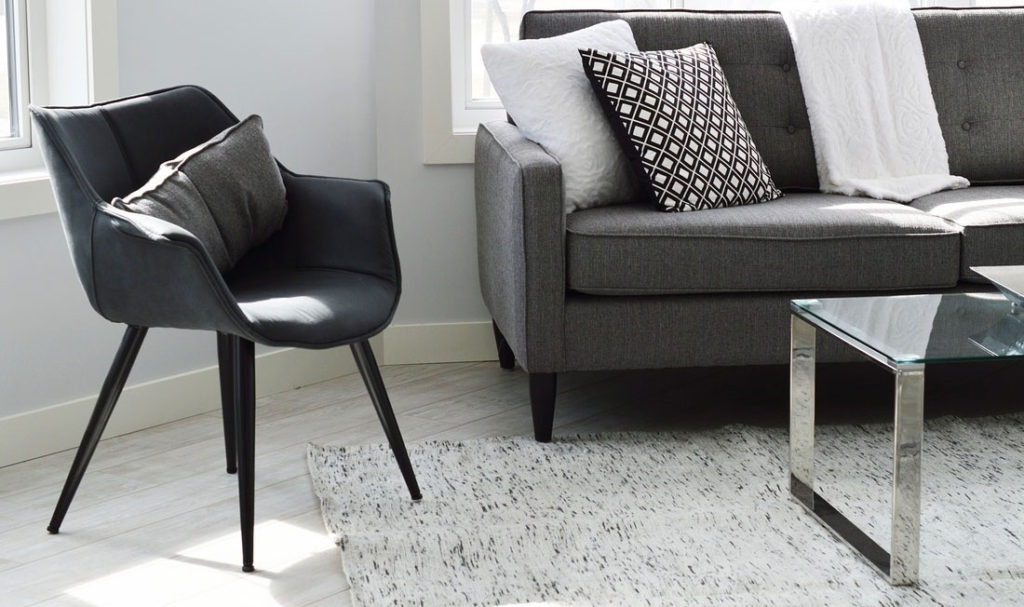
Limit the number of different patterns, materials, and finishes. When installing flooring, countertops, cabinetry, and other fixed surfaces in a small space, it’s best to keep the design simple as the lack of intrusive patterns helps promote the illusion of a larger space.
Also, use similar colors in adjoining rooms to visually unite them. To the eye, the harmonious connection of the similar colors will blend the two smaller rooms into one larger space.
19 – TAKE IT TO THE CEILING
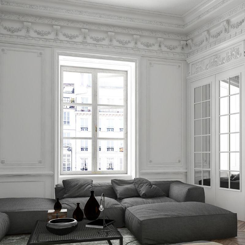
One great way of maximizing vertical space is by adding ornamental details around the ceiling line. Crown moldings are a stunning example but can be quite expensive.
One inexpensive but effective method is using textured, paintable wallpaper as a ceiling border. If your ceilings are white, either paint or leave them white. Otherwise, paint them the same color as the ceiling to extend the height of the ceiling.
20 – MIRRORS, MIRRORS, ON THE WALLS
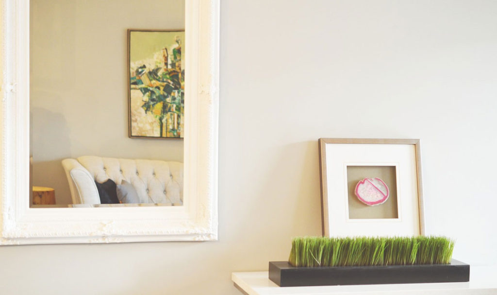
Mirrors are probably the single-best way to expand visual space in a small space. By using mirrors to reflecting other parts of the room or other areas outside of the room (e.g. angling a mirror to provide a reflection of another room or the outside window), they create visual space like nothing else.
Mirrors are also excellent at bouncing light around, adding to the feeling of space.
And there’s no need to limit mirror placement solely to the walls. Mirrors can be used in a variety of ways to increase the feeling of space.
21 – ELIMINATE, IF YOU CAN
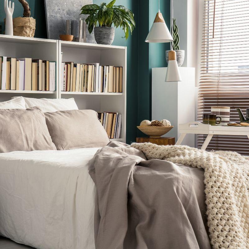
If there’s a way to get rid of pieces of furniture… do so. For example, by using built-in drawers and shelves in the closet (or the headboard), you can eliminate the need for a chest of drawers, a bookshelf, or an armoire.
Multi-purpose furniture, that can serve multiple uses, is also a great way to combine and eliminate unnecessary furniture pieces.
Extending the countertop slightly, or adding a “dropped” counter can provide space for chairs or bar stools, eliminating the need for a kitchen table.
22 – UP WITH TEXTURE
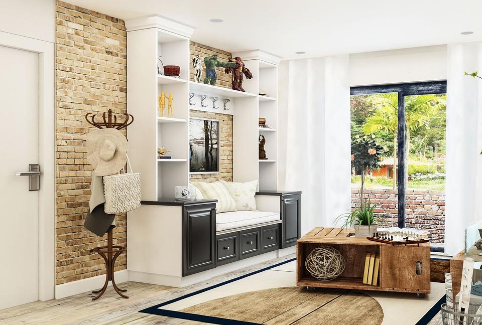
Use fabrics with texture as opposed to patterns to add interest without adding visual clutter. Simple-patterned wall tapestries are a great example of using texture to create visual impact.
Exposed brick (including real and faux brick) is a great way to add some visual texture without creating an overwhelming pattern that can close the space in. But try to keep the color on the lighter side.
23 – I’LL SEE YOU ‘ROUND
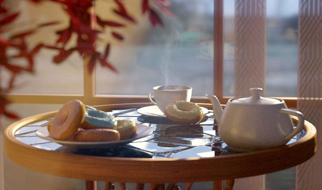
Rounded or oval tables take up less visual space than rectangular ones. Of course, if the table is supposed to be set against a wall, this rule does not apply.
A favorite among designers is the round clock table, which provides both form and function.
24 – RAISE THE ROOF
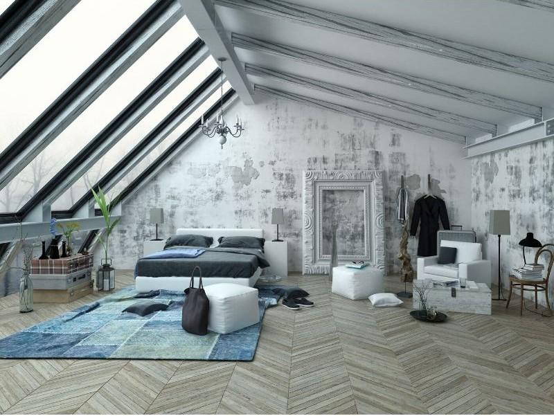
If your building style and budget will allow, consider converting the attic space into a vaulted ceiling.
This also allows for light-giving transom windows or skylights. Expanding the vertical space of a room – or an entire studio apartment – gives the illusion that it’s much bigger than its actual square footage.
25 – CREATE AN ARTIFICIAL VIEW
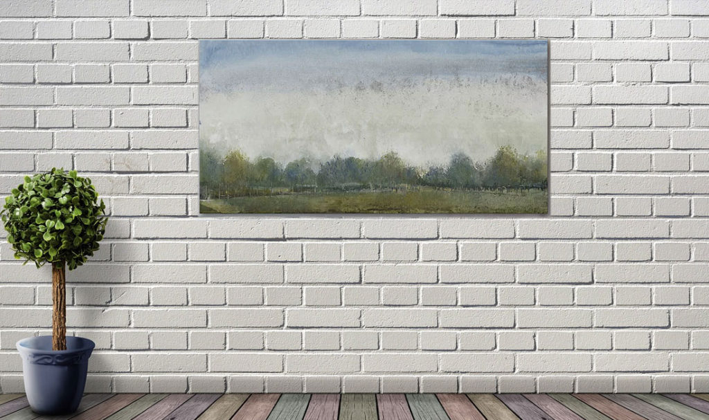
If you don’t have a lot of windows in the small space you’re dealing with, create an artificial view using a landscape painting or tapestry wall hanging, something that provides a visual representation of the space outside of the room.
However, this artificial view should be clean, spacious, and open. A busy landscape will effectively “pull back” into the room, which may not be the effect you are looking for.
Have any tips to add? Use the comments section below to share your own Small Space Decorating Tips.


Your tips are amazing to decorate small spaces. I am so pleased to found this post. Thanks and keep sharing.
Great Tips! Your tips are very helpful. Thanks a lot for sharing.
I can’t wait to read far more from you. This is really a wonderful web site.