One of the most common questions I get asked has to do with living room layouts & measurements. People are often curious about how big furniture should be, where tables can and should be placed, the size options for area rugs, and so on.
When it comes to designing the layout of your living room, there are a lot of factors to consider. How big should the room be? What kind of furniture should go in it? Where should the area rug go? In this blog post, we will answer some of the most common questions about living room layouts and measurements. We will also provide size options and placement tips for furniture and area rugs. So, if you are planning on redesigning your living room, or just want to learn more about the topic, read on!
Although I will freely admit that – sometimes – rules are made to be broken, it is important to understand those rules before you decide which to break (and why to break it).
With that in mind, here are three of the most important “rules” when it comes to designing a living room layout:
The first rule is that your furniture should be proportional to the size of your room. This means that if you have a small living room, you should not put large, bulky furniture in it. Conversely, if you have a large living room, you can go for bigger pieces.
The second rule is that your furniture should be placed in a way that allows for easy traffic flow. This means that you should not put all of your furniture up against the walls. Instead, you should create an open space in the middle of the room.
And finally, the third rule is that you should have at least 18 inches of space between your furniture and the walls. This will create a sense of openness in the room and make it feel more spacious.
Now that we’ve gone over some of the basic rules, let’s talk about specific measurements and layouts. The following are some of the key guidelines for living room layouts & measurements to help guide your decor creations.
 Consider the Purpose of the Space
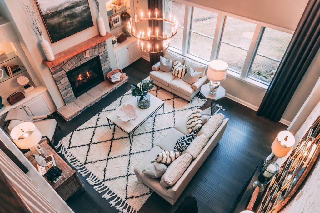
First things first, you need to understand what you plan on using your living room for.
A living room can serve many different purposes depending on how you want to spend your time. Will it be used for entertaining guests? If so, how often and how many? Is the primary purpose to binge shows on Netflix? Or is it meant for playing board games or putting together puzzles?
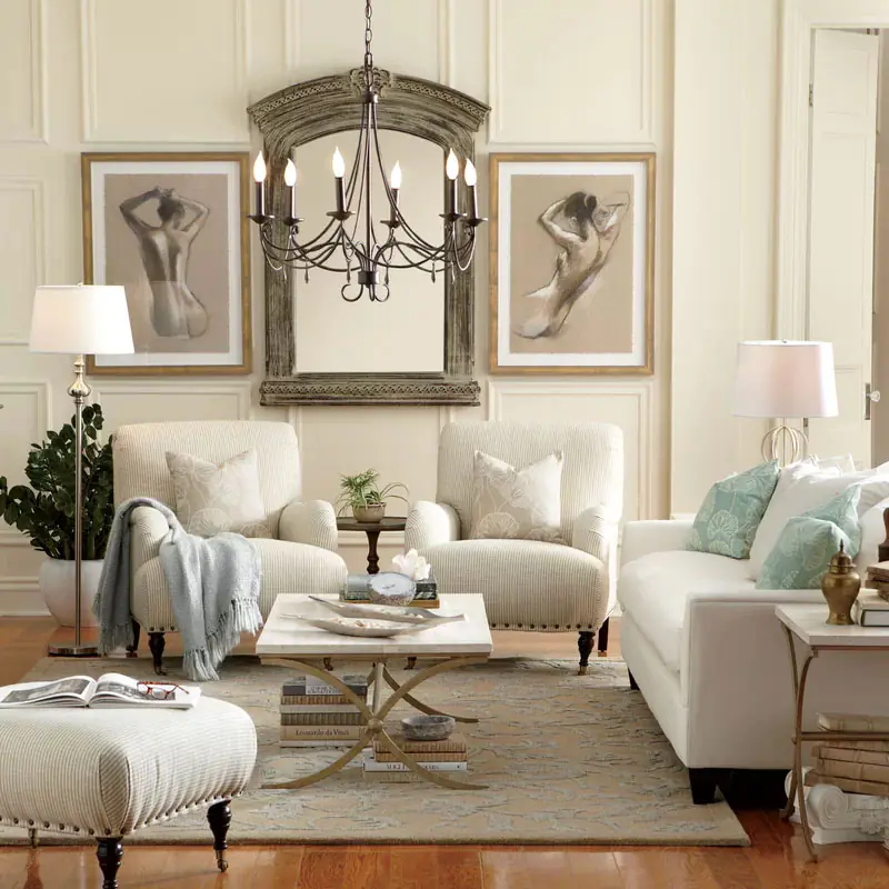
You need to understand and prioritize those purposes in order to create the right mix of furniture and flow. If watching TV with your partner (or by yourself) is the primary purpose of the living room, the central focus of the room should be be the TV and all furniture can face it.
Plus, you don’t need a lot of room for traffic flow if it is just one or two people who will be entering or leaving the space on a regular basis.
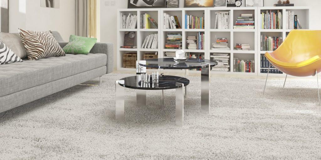
However, if the TV is second or third in your list of important activities, it can – and likely should – take up a different spot in the room.
|
Quick Tips:
|
 Consider How Traffic Will Flow In, Out, and Around the Room
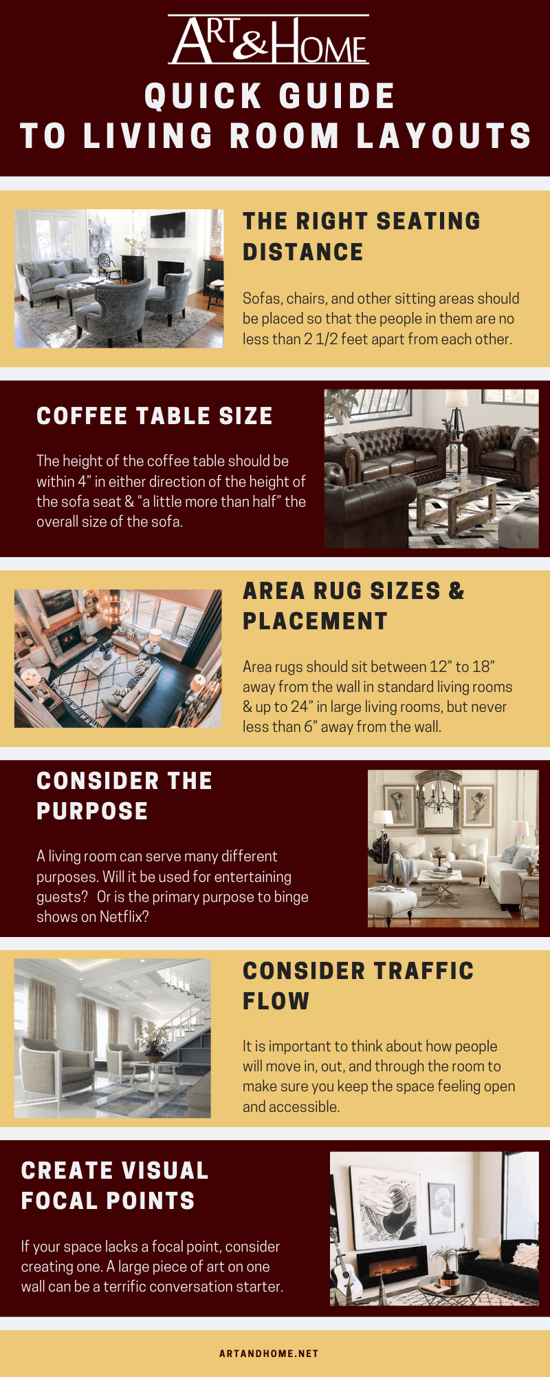
 It is important to think about how people will move in, out, and through the room to make sure you keep the space feeling open and accessible.
Make sure you don’t block key entry and exit points with bulky pieces of furniture and leave enough walking room around larger pieces so that people can enter and leave the space without having to “shimmy” past a piece of furniture.
You also want to think about cleaning the space. You don’t want to have to move the coffee table every time you pull out the vacuum.
|
Quick Tips:
|
 Feature and/or Create Visual Focal Points
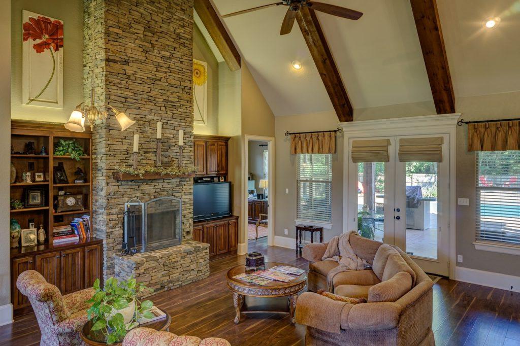
A focal point can be anything you want it to be, from the High Def TV for movie or video games lovers, to a bookcase for the bookworm, to a fireplace, a window, or even a spectacular piece of art.
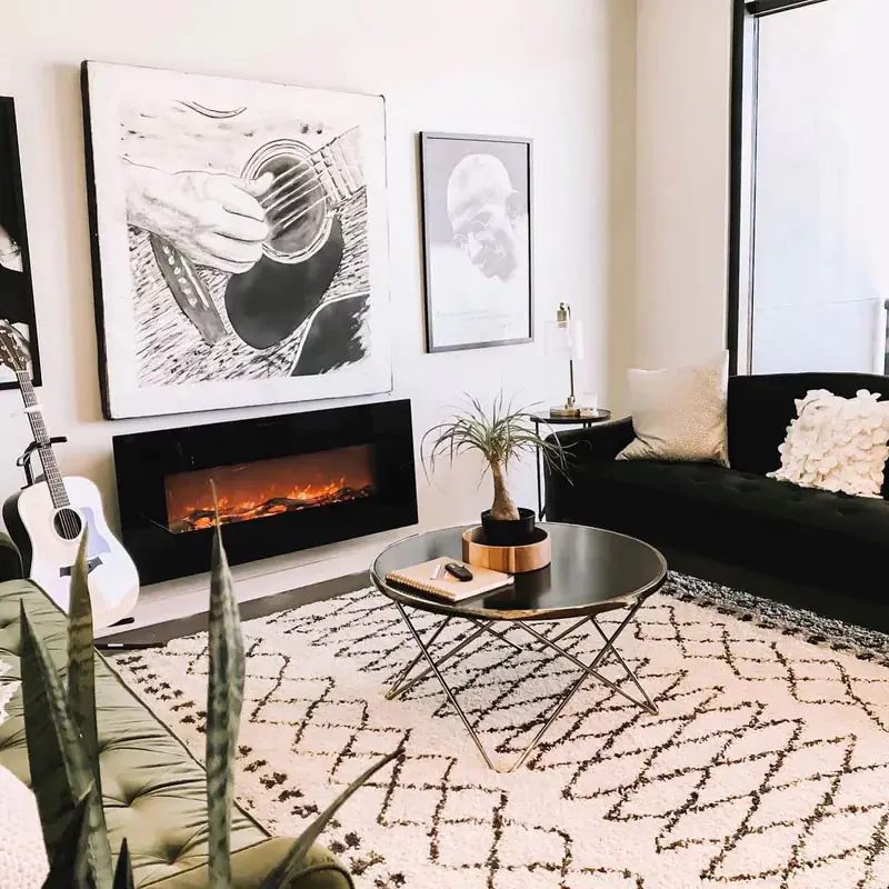
If your space lacks a focal point, consider creating one. A large piece of art on one wall can be a terrific conversation starter. But make sure it’s a piece of art that you love. After all, you don’t want to have conversations about some random thing you don’t care about… that’s what work is for.
|
Quick Tips:
|
 Creating or Hindering Conversation
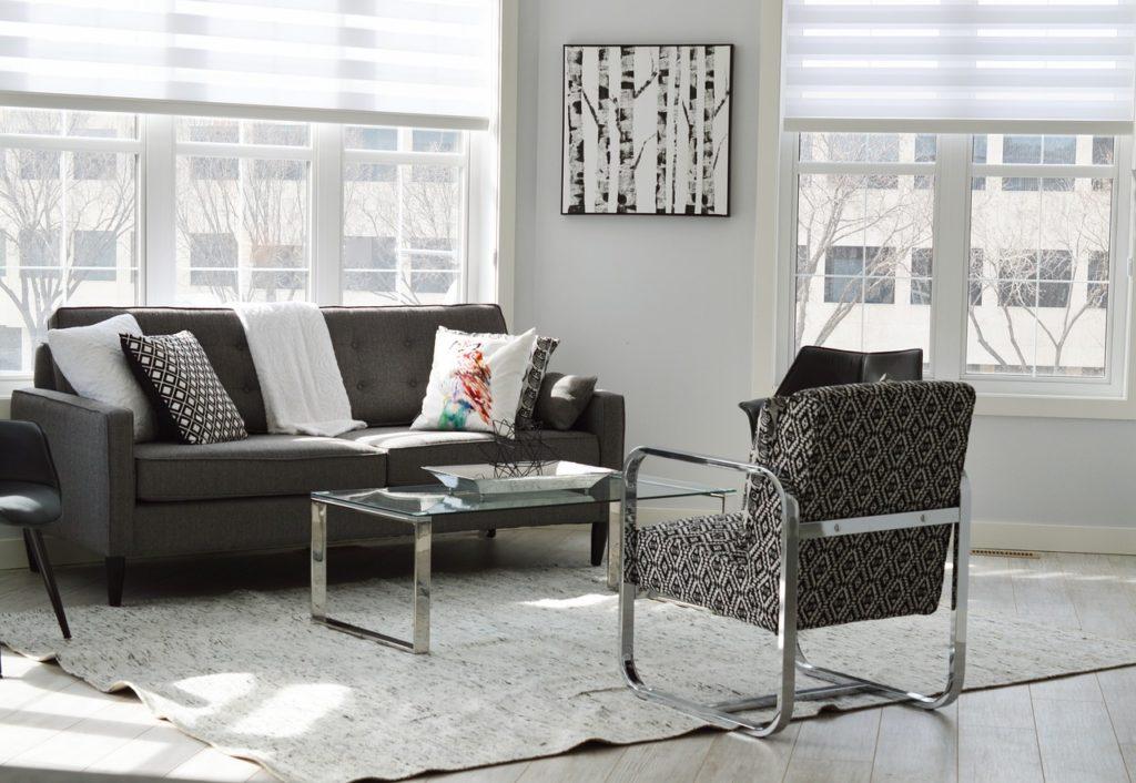
Chairs facing each other fosters intimacy and conversation. Accent chairs off in their own corner and isolated and should only be used if the intended purpose is solitary (e.g. a reading nook). If the sofa and chair both face the television, it will reduce the amount of chatter during the film (which can be a good thing).
In general, the way you position your furniture will determine how people will interact with each other and use the living room space.
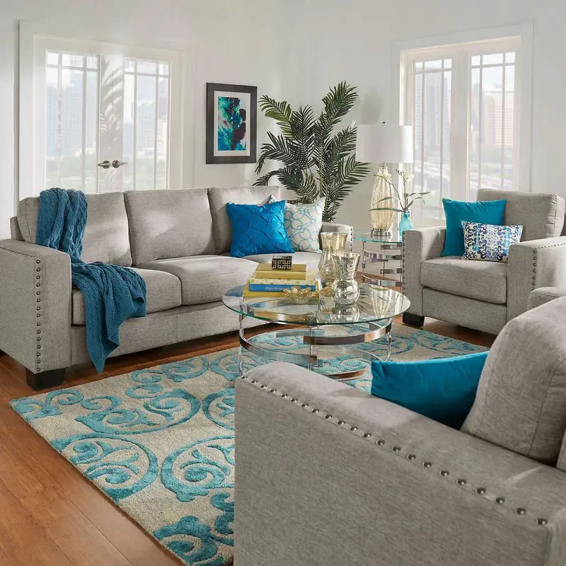
If you want to bring people together, place chairs in groups of two at minimum, angled – even if only slightly – towards each other. Alternatively, you can set the accent chair next to the sofa to create an open, inviting, and friendly space.
However, if the purpose of the living room is to sit and read in silence, or two watch TV, you can keep the furniture pieces more separated and have them all pointed at the TV instead of at each other.
For a multi-purpose space, you need to ensure that your space can work well for a number of activities. Place seating in an arrangement that makes it equally easy to have conversations or watch a movie. Swivel chairs can be excellent in this particular situation.
|
Quick Tips:
|
 Setting the Right Seating Distance
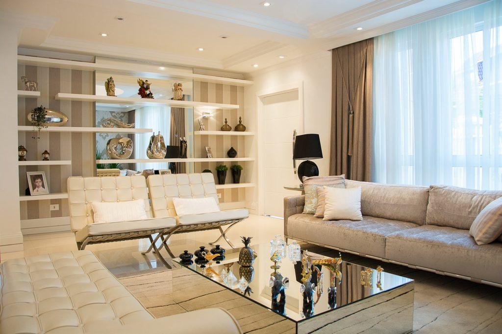
Sofas, chairs, and other sitting areas should be placed so that the people in them are no less than 2 1/2 feet apart from each other. This doesn’t mean that the furniture needs to be 3 feet apart, as larger (or overstuffed) sofas & chairs with large armrests provide a certain amount of buffer room space through their bulk alone.
Anything closer than 2 feet will make the room feel overstuffed and could lead to a sense of claustrophobic design.
This also provides the needed 30” to 36” of walking space between and around the larger pieces of furniture.
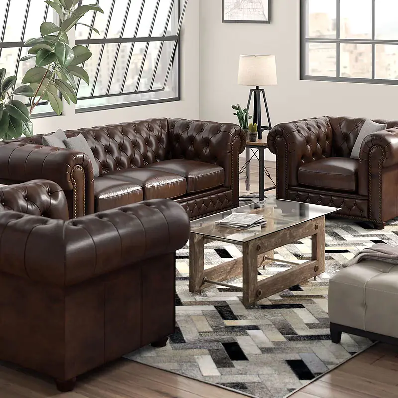
An exception to this rule is if/when you want to create a very intimate sitting area within a larger space. In that case, leave more space around outer edges of the furniture and bring the pieces within the conversation space closer together.
But don’t over-correct and push things out to far from each other.
On the opposite side of the scale, seating should not be any further than 10 feet apart, as that is too separated to create a cohesive space. If you have a very large living room to fill, consider creating more than one seat grouping, so that people can sit together in pairs or groups.
|
Quick Tips:
|
 Coffee Table Sizes & Placement
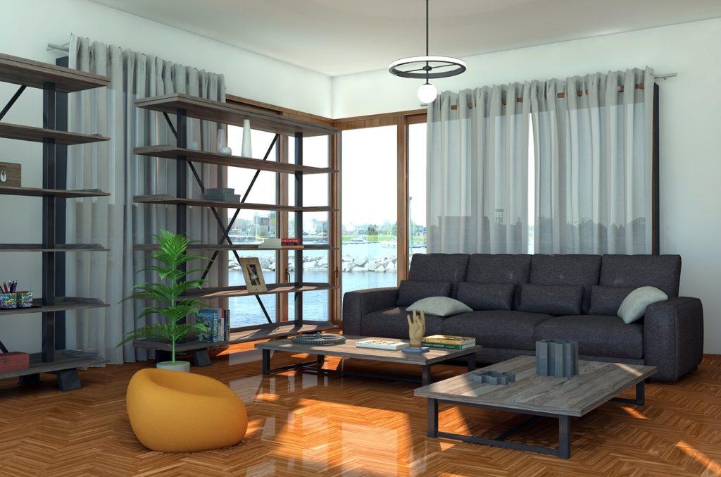
If you’ve ever shopped for a coffee table, you know that they range in size. Picking the right size for your living room has to do with both form and function.
Going back, again, to the first part of this post… it’s important to understand what the coffee table will be used for when helping to pick the size.
If it will truly just be used to hold a cup, or two, of coffee… you can keep the table on the smaller scale. If you intend on gathering around it to play card or board games or want to be able to layout large spreads of appetizers, you’ll need a larger surface space.
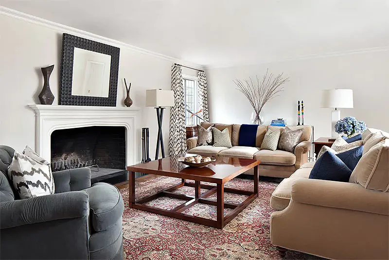
When it comes to placement, the general rule of thumb is that you want it to be close enough to reach for what’s sitting on the table (coffee, a book, a snack, or the remote control), but far enough away to offer plenty of leg room and avoid banging your shins on the coffee table every time you stand up from the couch.
|
Quick Tips:
|
 Side Table Sizes & Placement
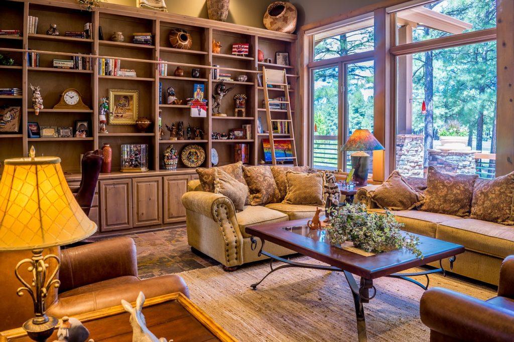
An end or side table can be a very handy feature in a living room. Not only do they provide space for additional decor accents, lamps, etc. but they also serve as additional surface space in the room for more coffee.
For ease of placement (and removal) of things from the end table, or to be able to reach the light switches on the lamps, experts recommend that a side table height should be around 3” shorter than the arm of the chair or sofa. For sofas & chairs without arms, aim for a side table that is no more than 8” above the seat height.
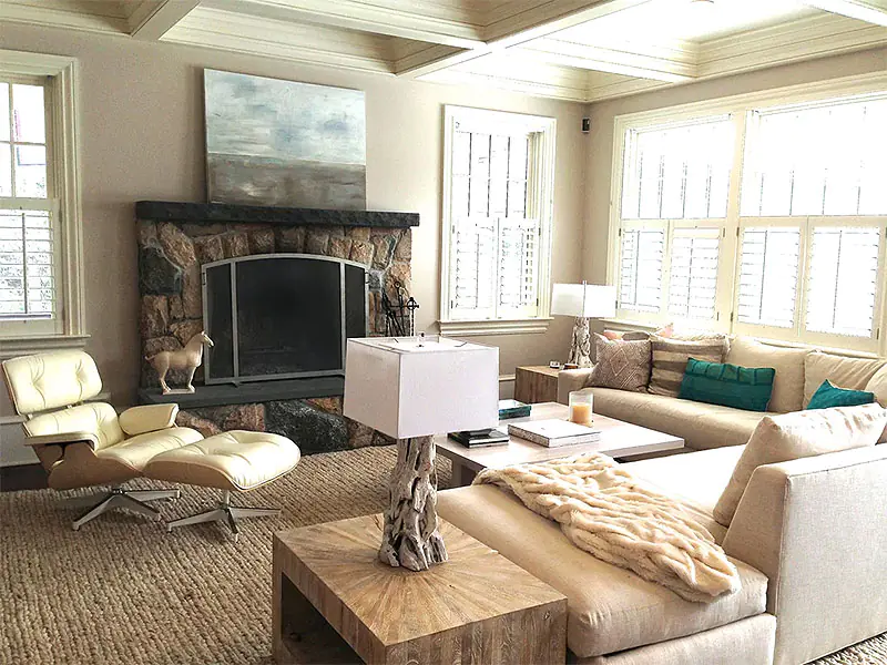
Unlike coffee tables, which require one to lean forward to reach the items on them, side tables need to be closer to the chair so that things can be reached without reaching. Aim for no more than 12” between where your arm comfortably rests on the chair or sofa to the edge of the side or end table.
|
Quick Tips:
|
 Sofa Table Sizes & Placement
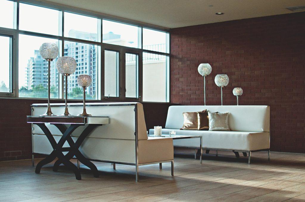
Sofa tables, often referred to as console tables, are those pieces of furniture that site behind the sofa, often in a living room layout that has the sofa in the middle of the room instead of against a wall.
For the pure and simple reason that you don’t want to lean back in the sofa and hit your head on the edge of the table, these sofa tables should never be taller than the height the sofa back. It also looks better that way.
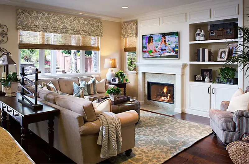
When it comes to width, sofa or console tables can range from about half the width of the sofa all the way up to nearly the full width, but should always be at least 1 foot shorter than the sofa to allow for 6” of exposed sofa at either end.
|
Quick Tips:
|
 Area Rug Sizes & Placement
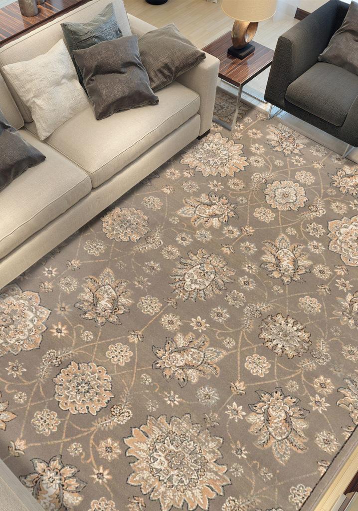
Area rugs is one area (pun intended) where rules change constantly and can be broken easily.
The general rule us that area rugs should sit between 12” to 18” way from the wall in standard living rooms, up to 24” in large living rooms, but never less than 6” away from the wall. If you’re going less than 6” away from the wall, you might as well lay wall-to-wall carpeting instead.
There are three common layout and size options when it comes to living room area rugs.
All Legs on the Rug
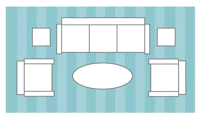
Using a large enough rug so that all the living room furniture rests within its borders is the best choice for anchoring a seating area within a large living room or open-concept space. Basically, any time the furniture setting would sit away from an anchor wall.
By placing all furniture on the rug, you instantly create a unified and defined seating area.
Just the Front Legs on the Rug
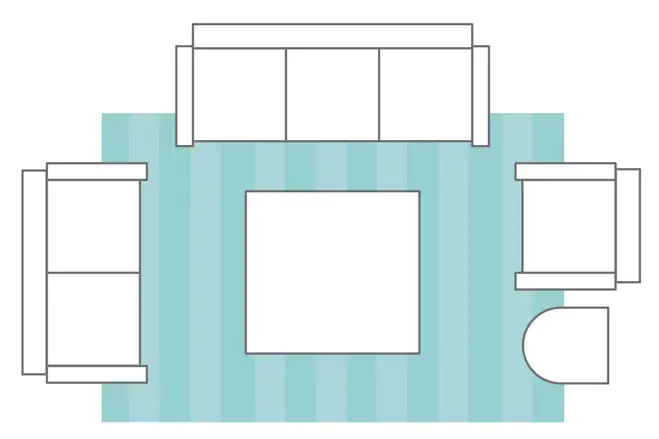
This area rug placement option works well when at least one part of the furniture grouping rests against an anchor wall.
To achieve this look, the area rug should be sized to allow for front-legs of each piece of furniture around the perimeter to rest on the rug. Normally, you want anywhere from 6” – 12” of the rug to slip under the furniture, anything more than that is a waste of rug.
Just the Coffee Table on the Rug
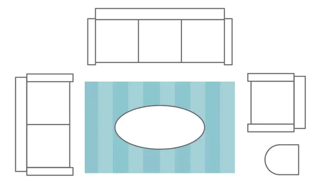
The smallest of the options, this layout is perfect for making smaller living room spaces feel bigger by playing with scale.
To get the right size, measure the interior dimensions of your seating area and aim for a rug that fills the negative space, allowing for 4 – 6” of floor to show between the outer furniture edges and the area rug itself.
|
Quick Tips:
|
 TV & Media Center Sizes & Placement
Not everyone watches TV in the living room. Not everyone watches TV, period.
If the main purpose of the room is to gather for conversation but – every once in a while – you watch TV, it’s ok to put the TV off to the side, like in this example.
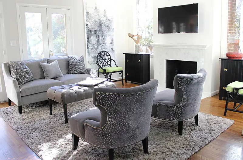
But if watching TV is one of the core purposes of your living room, the placement of the TV stand or media center is important from both a visual and a functional standpoint.
Electronic experts will tell you that you should be looking straight ahead and slightly down at the television, making the optimal height for the center of the screen at about 30 inches above the lowest seat height in the room.
However, most wall mounted TVs buck that trend and many people watch TV while looking slightly up without any issue at all.
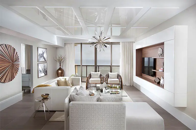
When it comes to distance, the quick rule of thumb is put the TV 1.5x the diagonal measurement of the screen away from the main sitting areas.
That means that if your TV measures 60”’ from the bottom left corner to the top right corner, you should put your TV 90” (or 7.5’) away from the face of the person watching it.
Secondary seating (for occasional guests) can be slightly closer, slightly further away, or at more of an angle to the TV.
|
Quick Tips:
|
 Decor Accent Placements
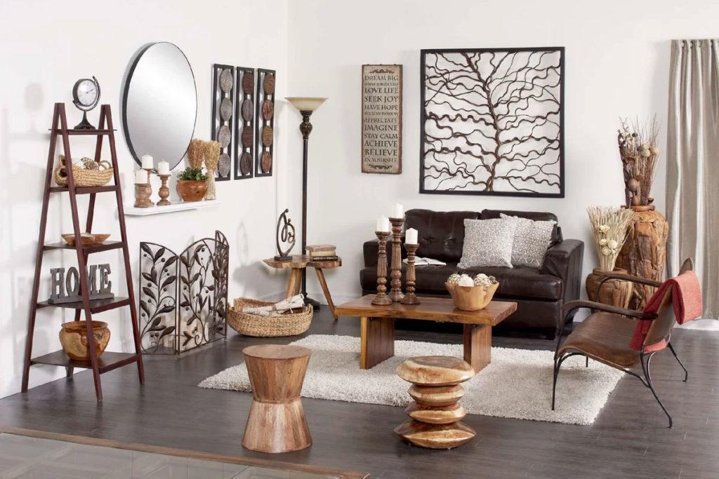
Now that all your furniture, your area rug, and your TV or media center are in the right place, it’s time to add the final touches… the decor accents.
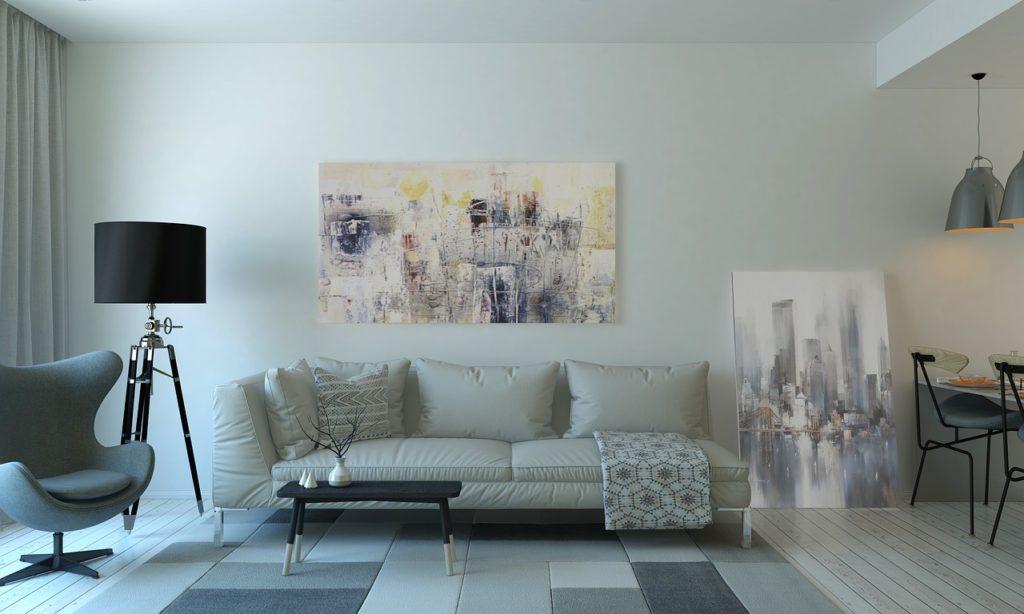
When adding lamps, vases, photos, wall art, or other decorative objects to a room, there’s less in the way of rules for layouts & measurements and more general guidelines for placement to create the right finished product.
|
Quick Tips:
|
In the End, the Choice is Yours
Whether to follow these guidelines or not is your choice. Sometimes, rules are there for a reason. Sometimes, rules are made to be broken.
If you LOVE the way the room looks, even though you’ve bent or broken some or all of the rules above… it’s your home and your opinion matters most.
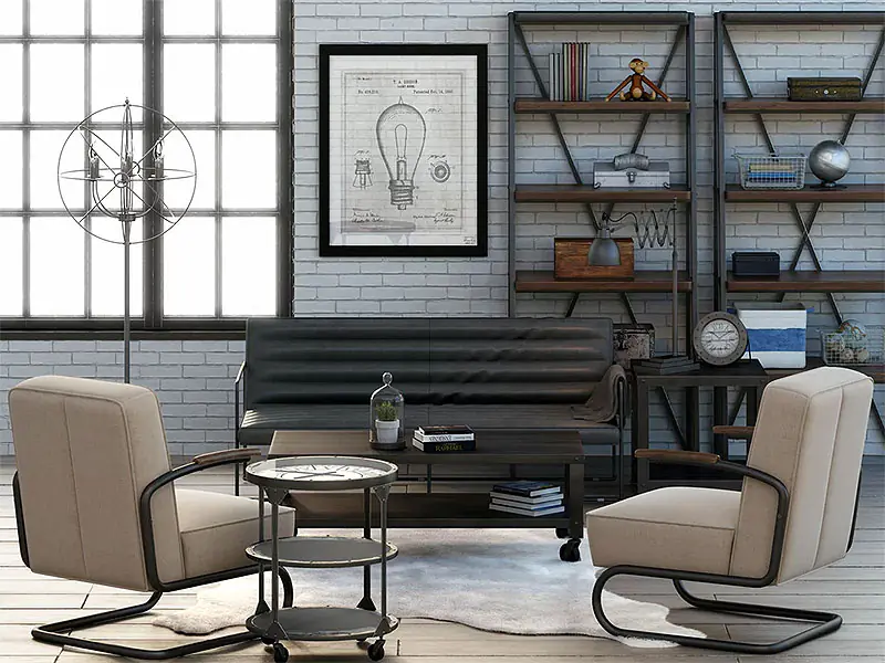
Guide to Living Room Layouts: The Infographic


Want Some Inspired Living Room Decor & Design Ideas?
Check Out Our Inspiration Galleries!


 Consider the Purpose of the Space
 Consider How Traffic Will Flow In, Out, and Around the Room
 Feature and/or Create Visual Focal Points
 Creating or Hindering Conversation
 Setting the Right Seating Distance
 Coffee Table Sizes & Placement
 Side Table Sizes & Placement
 Sofa Table Sizes & Placement
 Area Rug Sizes & Placement
 TV & Media Center Sizes & Placement
 Decor Accent Placements
I’m glad you mentioned placing a big rug under the furniture or right in front of it. We want to buy a new rug to put in our living room that has a more modern design to it. It looks like we should find a big one since we have a lot of chairs and couches in that room.
When I arrange my space maximizing the vertical space and divide the space is a better option. When it comes to the seating area I will always choose the L-shape seating area and I also pull the furniture away from the wall and lastly I form a straight walkway with rugs.