Colors have an impact on how we feel, so understanding the color psychology when selecting bedroom paint colors can help you match your unique style & personality.
It should no come as a no surprise that the psychology of color has long been leveraged in marketing for a very long time. Color has such a huge impact on our lives, that it makes sense how smart companies would use your personal connections with colors to help reinforce the image of their brand.
The fact that Starbucks has a green logo—representing health and sustainability—shows us that. Think about the vibrant red of the Coca-Cola logo. Or Cadbury’s rich, decadent purple wrapping. You can see the subtle influence of color in product packaging, logos, and marketing everywhere you turn.

A logo’s color can say a lot about a brand. For established brands, a color can be intrinsically linked to the business’s identity.
Canva
Think about it this way: Would you buy a heavy-duty pickup truck from a car company that had a logo decked in pink bubble letters? Probably not. Don’t get me wrong, there’s nothing wrong with the color pink, but that color tends to symbolize youth and sweetness, not heavy-duty trucks.
You may not even realize what’s happening, but your perception of color is also affected by your own personal experience and cultural background. Perhaps you – for personal or cultural reasons – have an aversion to the color red. If that’s the case, you may choose Pepsi as your cola of choice without fully realizing why.
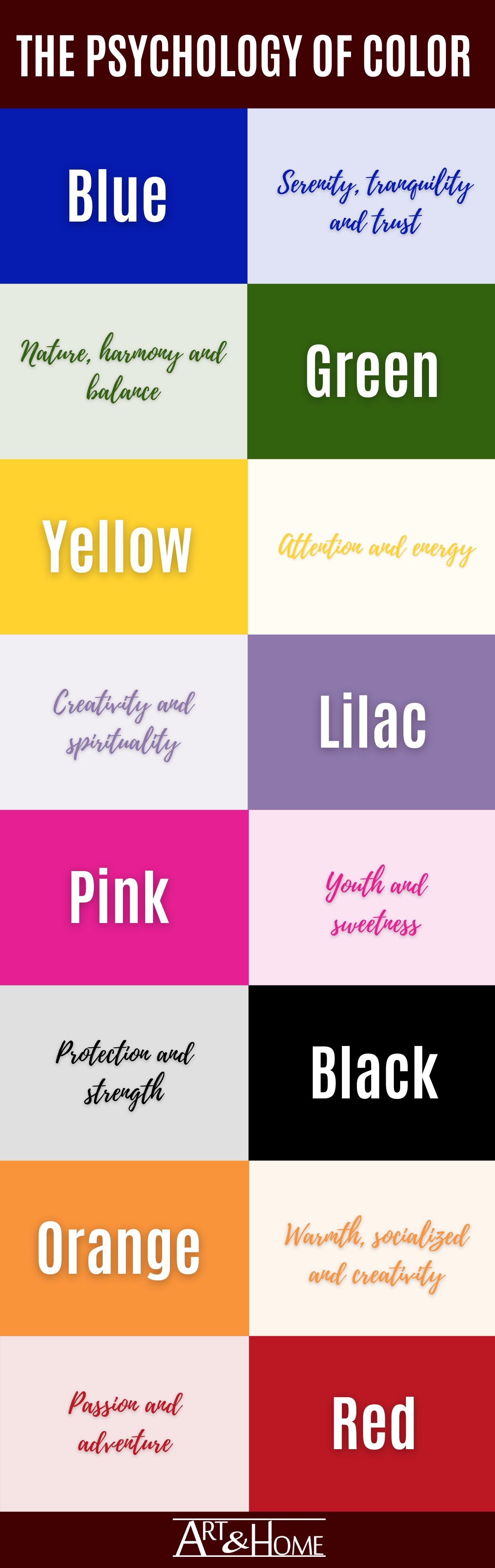
In Western cultures, red means danger, love, passion, and excitement, but in Russia the color symbolizes revolution and communism.
Do you think that white flowers represent innocence? If you are sending these flowers to a person of French descent, you may want to rethink that as many French people associate white flowers with death.
Cultural influence aside, there is a basic psychology behind how we are emotionally affected by colors.
Understanding this psychology makes it much easier to choose the right colors for your bedroom … to ensure a restful night’s sleep, that is.
How Does the Psychology of Color Work In The Bedroom?

Most people place colors into two broad categories: warm and cool. This comes from the natural propensity people have to associate colors with real things in the world.
Red and orange are categorized as warm, a reflection of sunlight, fire, and heat.
Blues and greens, on the other hand, tend to be categorized as cooler colors as they are connected with the images of the sky and water.
This association of color with a broad category impacts not only how you feel when you are surrounded by a certain color, but can have physical ramifications, too:
“An executive for a paint company received complaints from workers in a blue office that the office was too cold. When the offices were painted a warm peach, the sweaters came off even though the temperature had not changed.” (Source)
That old saying ‘seeing red’ when you’re angry isn’t an accident as the color red tends to stimulate the senses and raise blood pressure. For this reason, some people avoid creating a red bedroom because they want their nighttime respite to be calming and peaceful. However, a rich, red bedroom can be a dramatic focal point in the home and can help stimulate passion in a new relationship.
On the other hand, a cool blue bedroom calm a person and lower heart rates. This is one of the reasons why blue bedrooms are so popular in today’s homes. However, the color blue – a “cool” color can feel too cold to some people who want to have a warm and cozy place to rest their head at night.
Humans react differently when exposed to colors, consciously or not. You might not even be aware of your reactions to colors, which is why it’s important to choose the right ones for your bedrooms.
So, while it’s clear that colors go beyond aesthetics, when it comes to decorating your indoor spaces you shouldn’t ignore the overall visual effect.
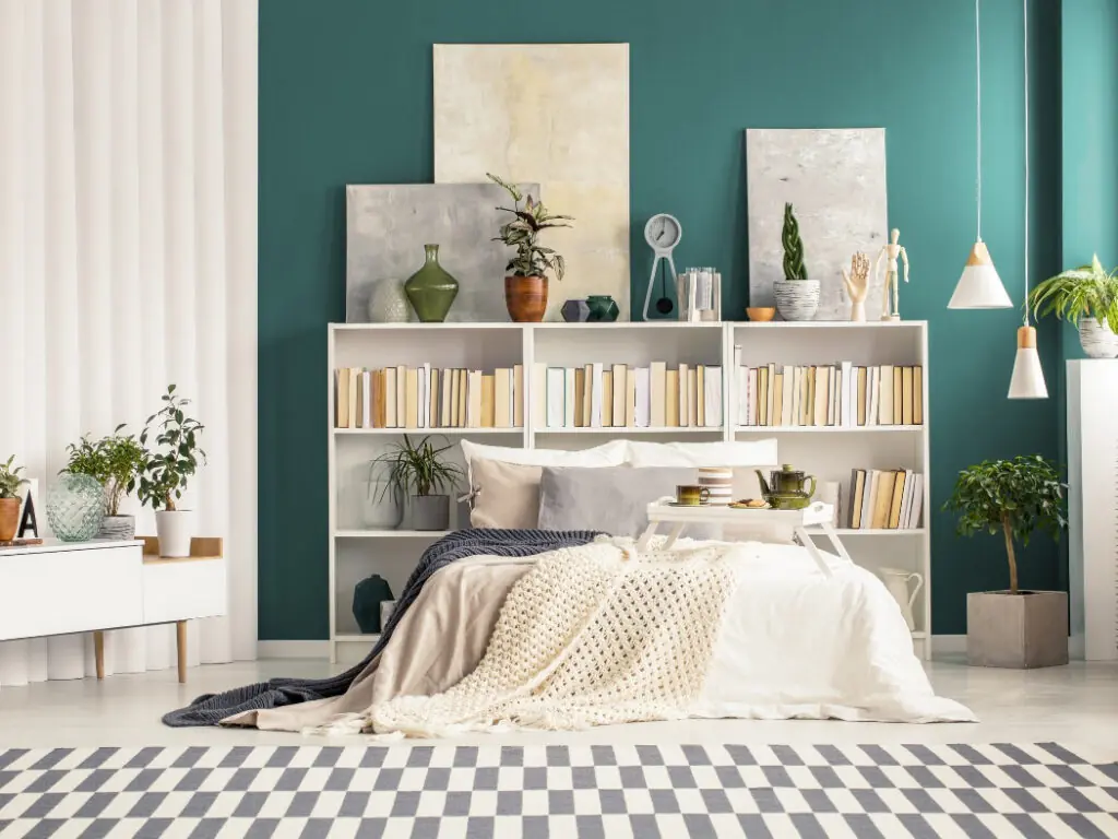
Although the color you paint your walls has the most dramatic impact on the color psychology of your bedroom, you can also achieve some of the benefits of color psychology with just a few accents, bedroom artwork, and smaller pieces of furniture, in different shades and textures.
Basic Color Profiles for the Bedroom and What They Mean
These profiles are all high-level generalizations and, depending on the quantity of the color you are using to decorate, and the shades, they may have more or less impact.
The Right Paint Colors For Bedrooms
While it is a very personal choice, understanding the psychology of color can help you to make choices that are most likely to encourage good sleep.

Master Bedroom Paint Colors
When it comes to setting a mood, the bedroom is one of the most important rooms in your home.
Gentle shades of warm colors including red, gold and even orange can enhance the sensuality of the space. Conversely, harsh hues can actually have a negative impact in that regard.
For example, reds and burgundies can be warming when used in moderation, but too much red or too bright a shade can seem aggressive and disturbing.
The flip side is that bright shades of green and blue can be jarring and too cold, but gentle hues can bring on a feeling of calm and serenity, which might be just the ticket for your boudoir.
One excellent option is to get the best of both worlds: stick with muted shades of warm colors for walls and trim, with the addition of gentle cool green and blue shades in accents like pillows and bedding. Or switch it up the other way round, whichever works better for your preferences.
Children’s Bedroom Paint Colors
While bright primary shades of yellow, red and blue will attract a child’s attention and stimulate their growing brains, they’re not considered soothing when it’s time for baby to drop off to sleep, or to get your school aged child to relax.
In fact, according to the American Psychological Association as reported by Painters of Louisville:
“Yellow is cheerful and warm, but it also strains the eyes, gives you energy (which is the opposite of what we want for our children when it’s time for sleeping) and apparently makes the little ones really unhappy.” (Source)
Gentle shades of blue, green, pink and lilac are considered most effective to help lull little ones to sleep.
There is also anecdotal evidence that shades of green can help to prevent nightmares, but this has yet to be fully studied.
Spare Bedroom Paint Colors
If you have a spare bedroom, you might be inclined to stick to more neutral shades like tans and greys, and that’s perfectly acceptable… especially as you are often decorating for company (and not for yourself).
Just choose some with warm, pink undertones to ensure a restful night’s sleep for your guests. You can always jazz up the warmth or coolness by adding accents, bedding, throw rugs, wall tapestries, or even artwork that reflect other moods.
No matter what colors you choose, it’s a good idea to stick to only a few throughout the entire house, so that there is a natural flow.
You can use different shades within a palette but, ideally, there is at least one shade that is in ALL of your rooms, bedrooms or otherwise.
That continuity creates flow and balance that help tie together your design and make the transition to and from your bedroom smooth and comforting.
Happy decorating! And Sweet Dreams!
